Problem
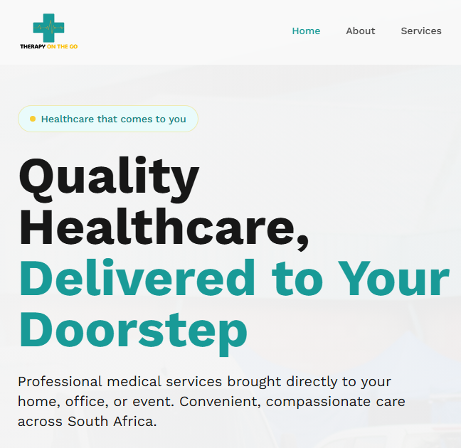
The business needed a credible, modern web presence to win corporate contracts for on-site health services. The previous site didn't communicate the breadth of services, didn't surface the "we come to you" value proposition clearly, and had no real lead-capture flow. It also needed to feel premium enough to be trusted by HR and procurement teams at large organisations.
Approach
- Brand-first design: A soft, healthcare-appropriate palette with generous whitespace, subtle motion and real photography from on-site events — no stock-medical clichés.
- Clear narrative arc: Hero → why choose us → core services → process (book → we come to you → receive care) → social proof → contact.
- Service clarity: Medical surveillance, wellness screenings, drivers' medicals, and corporate health each get distinct treatment with icons, plain-language descriptions and CTAs.
- Animation with restraint: Framer Motion stagger reveals on scroll, gentle hover lifts on cards. Motion supports the content rather than distracting from it.
- Lead capture: Contact form with React Hook Form + Zod validation, server-side email delivery via Nodemailer running on a Vercel serverless function.
- Performance & SEO: Lazy-loaded imagery, semantic HTML, single H1 per page, descriptive meta and alt text throughout.
Outcome
- Live at therapyonthego.co.za as the company's public site.
- Clear conversion funnel from homepage to enquiry, with validated server-side submissions.
- Reusable component library (Navbar, HeroSection, AnimatedSection, Footer) ready to extend into a booking app.
- Consistent visual identity that the team now uses across proposals and corporate decks.